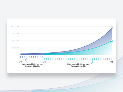
Compound Interest Graph
Been working through trying to easily visualize compound interest over time. The trick is showing Jack who invested early and stopped after 11 years. Then comparing it to Blake who started later in life and kept contributing until retirement.
The full piece goes into more detail, but the crux of the piece is the graph.
More by Bryan Meeker View profile
Like
