#dailyui #dailyui002
#002
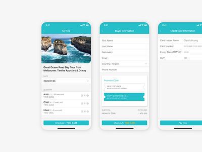
Checkout page
This one drove me crazy but also felt fun🥴
I tried the ios guideline to make the whole interface clean.
-Separate User info and card info into 2 pages to prevent users from feeling there are too many information to fill
-Visualize the promotion code, which was inspired by Klook's website. Also, it can shorten the considering period of users (big sale is the best)
