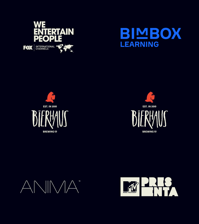
One Joke at a Time: Logo Collection Vol.1
Logos & how the world is changing
In an ever more populated and consumerist world, brand competition is growing faster than ever. Digital development is a fundamental pillar of the shift in the communication paradigm, and visual identity is no stranger to this exponential change. As communicators, we have to stop conceiving people as consumers and start seeing them as people. Digital media empowerment and information overload are forcing brands to be more honest and truthful. Brand design is no longer a commodity; it’s become a true primary communication and identity need in the face of so much competition.
However, as opposed to what’s happening with people, logos have become more and more alike, almost completely lacking personality. Brands have begun transforming their logos into sans serif typographies (mostly Helvetica, Gotham, Futura, and a few other grotesques) relying on the smallest array of colors.
“Less is more” was taken so literally that many of them don’t even use isotypes.
Nowadays, brands are mostly represented by their name written in a fancy type. That’s it. On the other hand, people are increasingly complex and unique; they feel more plural and open in their sense of belonging. There has never been a stronger sense of diversity in history, which is reflected by people pondering user experience (UX) over brand reputation. And that’s exactly why logos are in the spotlight again.
