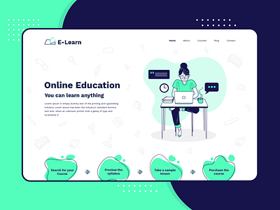
eLearning Landing Page Design
The cold and catchy color along with trigonometry shapes of this landing page has set a different level of the user interface.
Idea – The main idea behind this eLearning concept is for any student who wants to learn at any time. Through this web, they can learn the best of the courses on their one single tap.
Concept - The concept behind this eLearning web User interface is it provides the feature to students to register them on a website and allow them to access all the course they want. They can access them by logging in the website from anywhere. They can play pause the course from MediaPlayer. This Landing page website allows the students to start the course from where they left the course before, and also, they can continue from where they have skipped.
Tools - Adobe Photoshop
We’re available for new projects! Drop us a line at biz@cmarix.com or https://www.cmarix.com/inquiry.html#utm_source=Dribbble.
Press “L” and shower some love.
Want to see more projects? Visit our profile and remember to follow us!
Instagram | Behance | Uplabs
