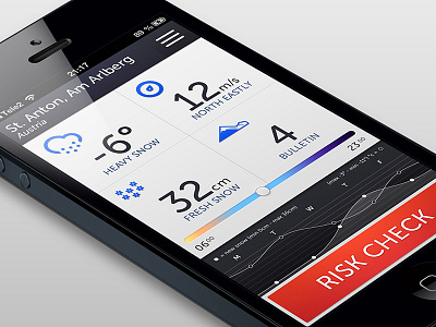
Safe zone - redone
So I had to re-make this one since i messed up last time. I didn't feel quite satisfied with the last one so I've changed som elements, stripped down the color palette and added a dark top bar.
I'm not quite sure about the top bar though. Should I go with the darker, kind of cosier, alternetive or the lighter, with better readability when there's bright outside?
More by Tobias Björsberg View profile
Like


