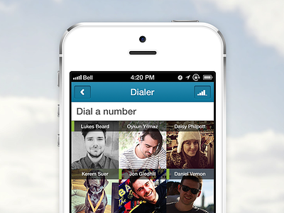
Dialer Screen
Hey guys I wanted to share with you what I have been working on since late last year when I joined the Truphone team.
We wanted to do something different with our dialer screen, as you can see here its a grid full of people. The idea behind this is that we display your most recent contacted people so you dont have to go fishing around for them. The little green line indicates that the contact is online so you are able to make a free call (referenced around the app, easy to get used to). We also include a neat search function where the keys dial for numbers and letters allowing you to easily get the contact you want without having the full number or name. In this version we also included a call quality meter, which measures your WIFI + GSM signal to give you an accurate measure on how great you signal really is (eg. if your on the end of a wifi area it wont be as great as it would be stood next to the router). And finally something that isn't shown in this mockup but we also give you the price of the call before its made, either here as your dialling the number or on the contact modal its self. The rates were dropped heavily be sure to check them out.
There are lots more UI updates + tweaks included in this version which I may post over the upcoming weeks
Feel free to download and give feedback, everything is taken onboard and discussed - we will also release our labs site shortly so you can get access to current stuff were building for the future releases.
Truphone App for iPhone
Truphone App for Android
Check out the full views - iPhone, Android.
Lastly been great working with Delmonto & Spencer on lots of stuff recently, check them out and give them a follow.


