PDF-filler redesign
Hey dribbblers!
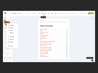
Today I want to show you my vision of the PDF-filler — online platform for document workflow automation, using the example of an editor page.
I unloaded the page - changed colors to lighter and pastel; grouped buttons by meaning and purpose. I hid the part under the dropdown, brought something out of the header to the bottom of the page.
The result is an easy, pleasant and intuitive interface.
Press “L” ❤️ if you like it
Eager to hear your feedback!
Have a nice day 😎
More by Ira Hofmann View profile
Like
