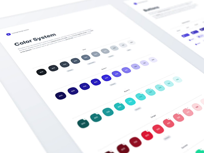
Leverege Design System: Colors & Typography
🔈 Turn the sound on and go ahead!
Some highlights
✨ Our color system is made using the HSL color model. Sometimes it’s enough to change only the Hue parameter to change the entire brand palette.
✨ All brand colors are presented in several shades. However, only the most necessary of them are included in the library.
✨ The style names use flexible numbering from 050 to 900. For each category, we can create up to 10 colors or even more. The analogy is taken from the font-weight property. In our case, 900 is the darkest color, and 050 is the lightest. This allows us to create logical palettes that are very easy to expand & crop. Less time for naming, more time for design.
✨ Type aligns to the 4dp baseline grid. But can be placed outside of the 4dp grid when it’s centered within a component, such as a button or list item.
It's pretty hard to explain everything using only text so I'll share some screenshots & videos about organizing component libraries in Figma on my Twitter, so stay tuned.
😌 In the meantime, let me know what you think about this animated presentation.
We’re available for new IoT projects! Drop us a line at business@leverege.com
Want to see more projects by our team? Visit our profile.
