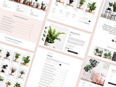
Ansel & Ivy
Another shot from Ansel & Ivy project
I worked with Ansel & Ivy as a part of team Deztopia for 10 months to build a seamless online retail experience for the people who are looking to shop for plants.
Location:
San Francisco, CA.
Project Type & Deliverables:
- Digital Strategy
- UI/UX Design
- Detailed Style Guide
- Iconography
- Email Designs
Check out their work at www.deztopia.com
The Client:
Ansel & Ivy is an online retail shop to buy plants 🌱, which have been hand-picked by the team especially for you and are shipped with love ❤️ and care at your doorsteps.
The Objective:
To design the digital presence of Ansel & Ivy based on the strategy addressing the brand values and objectives i.e. to simplify the experience of shopping for plants and make it easy to be a plant parent.
The Solution:
To create a distinctive style for the brand which sets it apart and communicates the values offered to the plant world. 🌱
We kicked off the project by closely analyzing the competitors in the market and interviewing people to investigate the challenges they face when they are buying plants online or offline. In parallel, there were many brainstorming sessions with the Co-founders to understand the company goals and their vision.
With a better understanding and insights into these, all our efforts started revolving around ‘how to facilitate access to products, their information and care instructions’. How to make it easier for the plant parents (new or experienced) to feel confident to adopt something as delicate as a baby. We started off with wireframes to structure information and content. From here we moved into building the design language, imagery, icons, typography, voice, and tone. As a result, we designed user experience and developed a brand language that was easy to use, navigate, accessible, approachable, minimal, and aesthetically pleasing.
Product photo credit: Ansel & Ivy
Link: www.anselandivy.com
