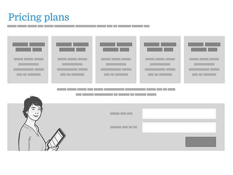
Pricing plans wireframing
I'm working on a responsive pricing plans page that needs to have a signup form so I'm spitting out a few quick layout options in wireframes. The tricky thing is going to be the mobile view - that sign-up form is going to be way down the page underneath these vertically stacked plans. Will the user be confused when they see the plan they want as to what the next move is?
(font is blokk btw - http://blokkfont.com/)
More by Kelly Dyson View profile
Like
