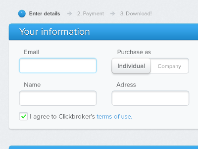
Clickbroker purchase form
A checkout form for the Swedish startup Clickbroker.
Decided not to go with the 'Purchase as' slider element, as it's really a radio button and this one looked like a regular button too much. But it's more good-looking, eh!
More by Jonatan Littke View profile
Like
