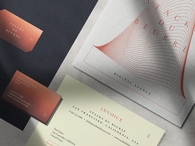
Visual Identity for Stacks du Beurre
This is an example of a stationery design for my client from SF. It was a completely new experience for me in the following things: communication, delivery and incoming information. I am very proud to be a part of this project
Follow me:
Behance | My personal website
More by Taras Hrybanov View profile
Like

