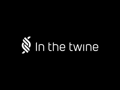
In the twine Logo
'In the twine' is a collaboration between two friends, passionate about creating handmade and eco-friendly bags, accessories and gifts.
The name of the company has a deep meaning for them so the logo had to reflect it.
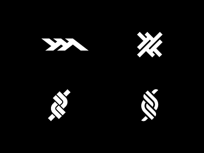
The logomark combines the structure of the twine, the idea of the intertwining threads, and the double "t" for the two of them, visualized symmetrical as a reference to their equality.
The customized sans-serif logotype incorporates elements of the mark contributing to the full lock-up.
Check out the full case study here.
.
If you have a design project you need help with, I'd love to hear about it! Contact me!
.
See more of my work on Behance and Instagram.