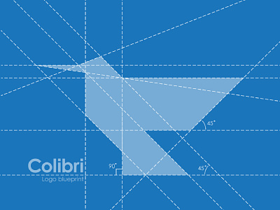
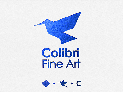
Colibri Logo Grid
Here's how I approach constructing a logo 👇
-
Too many people get caught up in trying to use the golden ratio when it's not called for. Or on the flip side make no effort to geometrically simplify complex designs. I've found the best results lie somewhere between.
-
In the ideation phase I don't consider geometric relationships excessively to allow for full creative freedom. Once I have a sketch that I like I take it to illustrator and begin construction using simple shapes, ellipses and straight lines.
-
However inevitably, by simplifying the design in this way I will lose some of the character of the original, or I will notice tweaking that would compromise the geometry but is necessary for the depiction to look correct.
I again allow myself to tweak and manipulate the logo so as to reach visual appeal rather than geometric excellence.
-
Once I have the logo looking spot on the way I want I look one last time to see if there are opportunities to simplify the design geometrically to achieve maximum visual satisfaction, by making angles the same lines intersect, curves rounded etc. Bearing in mind that occasionally it is the quirks that give a design character.
-
The key is not to remain rigid either way, and allow the design to speak for itself 🙃
-
Hope that gives you insight into my approach, let me know what works for you in the comments below, and let me know if you like this presentation format 🤙

