Konika Logo Color Gradients
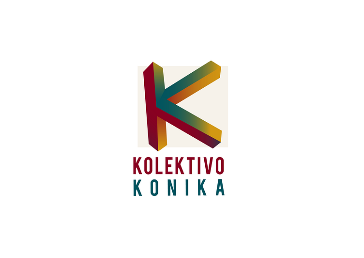
Kolektivo Konika, an international feminine contemporary circus company, asked me to develop their image, starting from their logo. I begun with a triangle shape, being it a shape related to feminine. From that I landed on the "impossible triangle", that have fascinated so many graphic designers, first of all Escher. I thought I had it, but that was actually the starting point of a research that brought me to an "impossible K". And here it is, the brand new logo for Kolektivo Konika, in a color gradients version.
Check out http://elgatoproductions.net/portfolio/kolektivo-konika for the design process and videos!
