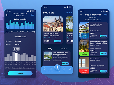
Trip365
Hi everyone!
I have been working on a trip planner and this is my another project on Dribbble!
Before creating this project, I did an analysis, user persona. To create a great user experience for this application, I've passed through the Customer journey map, Mind Map, Value Proposition Canvas UX artefacts. The next step was the development of UX. I tried to make it as user-friendly as possible. After I switched to UI-part. In this part, I decided to stick with dark colors and neon for contrasts, as well as rounded shapes.
Press "L" if you like it! And don't forget to follow me, i appreciate it.
Thanks for Watching!
More by Galina Buziyan View profile
Like
