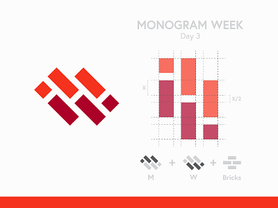
M + W + Bricks
M + W logo designed as part of the monogram week challenge; creating a logo using the same two letters everyday for a week. In this concept I combined the two letters using the shape of bricks, which I think is a compelling combination. Let me know your thoughts in the comments below 👇
More by Robert Nowland View profile
Like
