The New York Times Redesign Concept


Hey everyone 😀
---
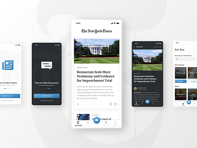
A few days ago I`ve come across a design challenge on UpLabs. The task was to redesign the existing "New York Times" app. I decided to add a few tweaks here and there in order to try to improve UI and UX. 🔥
---
As you can see I experimented with both dark and light themes. My goal was not to completely change the look of the app but to make it cleaner and easier to use. 🎈
---
I decided to use a serif font for the headings (Noto Serif) and a sans-serif font for body text. (Poppins). Regarding color-palette, I have slightly altered the original color scheme and introduced the gradients.
---
What do you think, which version do you prefer?
Let me know in the comments below! 🙌