NYC TAP Logo
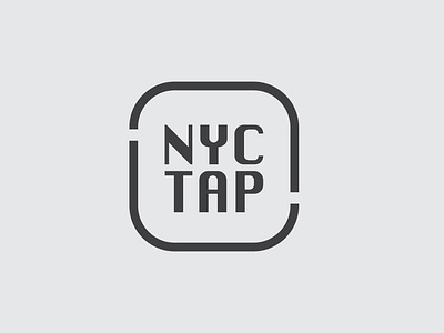
Creating the branding system for NYC TAP started with the logo. The goal was to create something that was simple and easily recognizable that called to mind big cities and utilities. The final design is something that wouldn’t look out of place engraved on a water meter from 10, 50, or 100 years ago. The split in the border is a reference to pipes, and the flow of water.
Full project at: https://danielle-kay.com/nyc-tap
