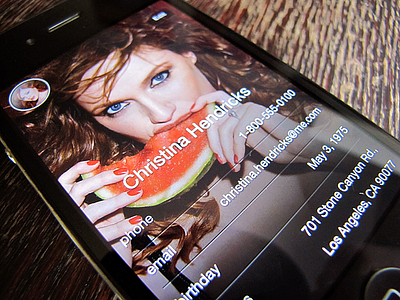
Contact Display
I was working on a better contacts app that would bring a simpler display of the informations. So I was thinking that instead of having the contact photo as a little avatar, we could set it as the background of the contact page. Then you'd be able to scroll down to see more infos.
I wanted the design to be as unobtrusive as possible.
The rounded avatar at the top left is the group of the current contact.
PS: Sorry Zooey.
More by Guillaume Gaubert View profile
Like

