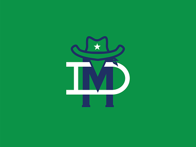
Dallas Mavericks monogram
This is the first logo in the series I plan on doing where I will redesign all of the NBA logos as monograms. I’m not a Mavericks fan, and I’m honestly not a fan of their current logo either. It’s a bit... horsey. However, I really like the Mavericks throwback green/blue palette more than their blue/dark blue one. I think it’s hard to design an NBA logo and resist the urge to shove a basketball somewhere. What do you guys think?
More by Trevor Grouss View profile
Like
