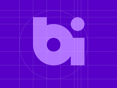
BI Logo Geometry
The client requested a logo made of the letter B and I. After experimenting with many concepts, using the lower case letters and playing with the negative space in the b and the dot on the i produced this result. The i is moved to the left slightly to connect deeper with the B. I will be working in a Deco style design and a gold palette.
More by Steve Reed View profile
Like
