Google APAC Comms Offsite 2020 - Logo Concepts


Recently i got contacted by Google to create a logo for their upcoming event - Asia Pacific Communications Offsite 2020 - where it will be decided what campaigns they will do on the Tokyo 2020 Olympic Games 🇯🇵
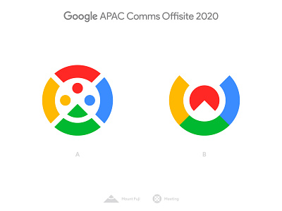
I decided to take inspiration on their G lettermark as well as on the colors to create a mix between the Mount Fuji and people meeting up.
While on concept A the concept of people meeting up is more clear, concept B is less obvious. The big advantage of concept B and the reason why it's my favorite it's the fact that it feels more on brand. It also has a stronger relation to the japanese culture because of the red sun behind Mount Fuji 🗻
Which one do you prefer?
--
📨 Got a project? Let's work together! Email: wisecrafted@gmail.com
--