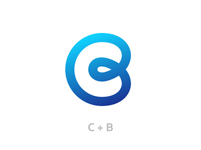
C + B Logo
Here is a Logo I designed using 2 randomly generated letters in order to challenge myself. I like the way it plays with positive and negative space, and it has a nice flow to it.
Let me know your thoughts in the comments below!
More by Robert Nowland View profile
Like
