LinkedIn | Home Redesign
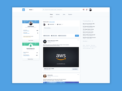
What if LinkedIn was a little less cluttered? A little bit easier to navigate?
This is an attempt at the LinkedIn home page/feed where I've created a more consistent visual rhythm for all of the elements and tucked some less useful features into more appropriate areas.
As always, I would love to hear what you think! Thanks for checking me out.