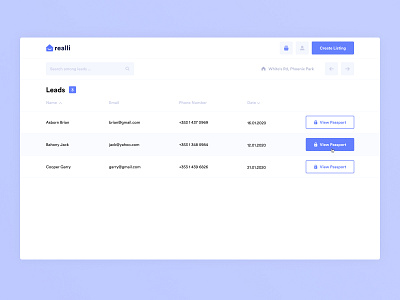
Leads tab
Hello everyone 👋
Here is a new agent dashboard lead tab design concept for Realli — Ireland’s new property portal.
Since I added the ability to track the number of leads to each listing, there should be a good UX solution to the leads validation tab.
First things first, I added the ability to switch between screens for each listing in consecutive order. Now the agent doesn't need to go out each time to a dashboard and switch a new listing.
Secondly, I've added a display of the total leads number, as one listing can interest many people.
Also added sorting by name and date so now it's easy to find certain people and start validating those who applied first.
The internal project name for detailed information by the person is called a passport. It has every user who wants to buy, sell, or surrender the property. Therefore, the opportunity to see this info is necessary here.
What do you think of this? Share your thoughts, drop a ♥️ if you like it and stay tuned for more!
Got a cool project in mind or need help with existing?
Drop me a line at ntnkodesign@gmail.com | LinkedIn | Dribbble
