SamExhibit - Early Marketing Design Concepts
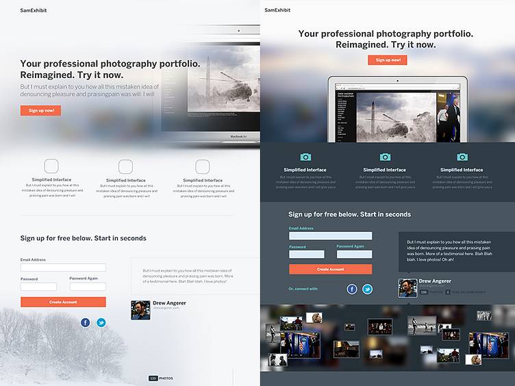
Diving in to the new SamExhibit marketing page design then on to the UI. The darker concept was the first, and just started the white one about an hour ago.
Clearly, rough ;) But wanted to share. Lots of things to work out and try but for the market that we're trying to go for the white seems a bit more appropriate (leaning towards the white.) Will keep posting more!
Thoughts/feedback even know its early, is appreciated!
More by Ryan Coughlin View profile
Like
