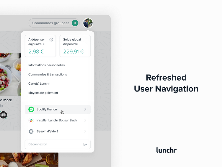
Lunchr User Navigation Concept
Hola Dribbblers 💃!
Hope you're well. 😊 I worked few months ago on a new user navigation for the Lunchr platform. It's a little refreshed interface with more white spaces, new hover effects, I added the little logos and I refresh the view of datas.
We will shot more works later, so stay tuned friends. 🙌
More by Swile View profile
Like
