eCAP (Symbol development)
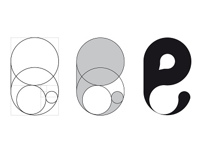
Logo development for a business that do online courses about the Oil & Gas industry, for who wants to make a carrer on it. We use drops as a starting point to create the "e" from the company's name - eCAP. Also, we used the golden ratio as a basegrid.