Stay Gold
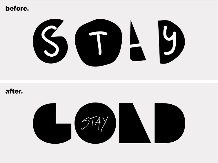
While the original logo may appear sketchy and deviate from traditional design principles, it is precisely these imperfections that give it a meaningful connection to the brand. As beginners in the branding world, we wanted to capture the nostalgic feeling of discovering skateboarding during our childhood. Interestingly, the original logo was actually created by a child (myself) having fun with Illustrator.
The redesigned logo is undeniably more elegant and versatile, and we may indeed use it. However, in some ways, it brings a sense of uniformity that the original logo lacks. It can symbolize the growth and maturity of the brand, showcasing a more professional image. However, personally, I don't consider it to be a superior version of the original. It's simply a newer option that aligns better with our current goals, necessitating adherence to the principles of good design.
