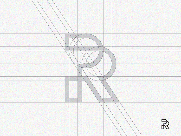
P+R monogram grid process
Another piece from my letter mark exploration. I designed it as letter R but after some time I realized that it looks more like P+R. Nevertheless, here's the grid system fo this mark.
Let me know your thoughts about this piece.
DM for commissioned works.
More by Dipta Design View profile
Like
