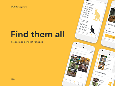
Zoo Mobile App UI
It is not easy to navigate within a Zoo with just the given map and signposts around. It’s often packed with visitors, making the information boards upfront of the exhibits unreadable. And to make bad things worst - often there is just not enough time to explore it all!
How would you solve this problem?
More by SPLIT Development, LLC View profile
Like
