Portfolio Redesign: Featured Work Slider
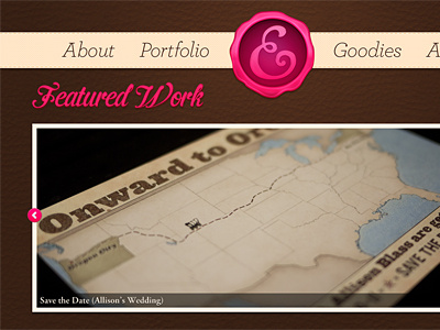
Zoomed out shot of the slider, it's pretty simple. I've also slightly desaturated the leather in the background so it wouldn't be as reddish. Added lighting/shadows to the header. I think I will actually stick with Archer in the nav for now, if I do change it it would be to italicized Neutraface 2.
The font for the headers (Featured Work) right now is Cider, but I'm debating switching it to Corner Store (which I could utilize via Typekit). I just need to actually buy Corner Store so I can see how it works in the mockup.
Forgot to add the dots below the slider for this shot, oh well. Rest assured there will be some there, centered below it.
More by Erica Schoonmaker View profile
Like

