Chase - Website Mock
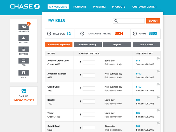
I have been banking with Chase for years and I am surprised that a big company like Chase has a banking website that looks like it's frozen in time. Due to a lack of UX and design the current site is rather hard to navigate and not the prettiest to look at. So I decided to use this as a little exercise, giving the site a more up-to-date look and at the same time making it easier to navigate.