At a glance
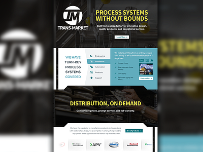
First look at the updated website for this client. There is a negative space pipe running through the sections, which resembles their new logo, and is symbolic of their product.
More by Brian Delaney View profile
Like
