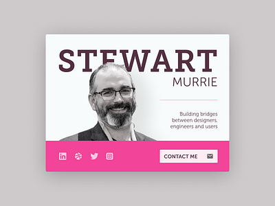
Contact Card
Practicing my visual design skills with some challenges. This was inspired by Ben Schade's "Xavier" shot.
I wanted it to be non-centered, but balanced. I liked the idea of depth through layering. Bright, bold colours aren't usually my style.
After critique, some things I would change:
* Allow the negative space to flow more through the piece
* Simplify the typefaces (it's all Museo, but it's too complex)
* Balance the colours a little more (it's all the same hue, but just changing saturation and brightness doesn't always work)
Like
