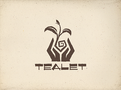
Final - Tealet logo
Per client's request, I made some minor tweaks to the hands to give them more weight.
Here is the final approved logo, but I'm undecided on color. Could use your help, guys 'n gals. See attachment.
From the beginning, I was drawn to the idea of two different colors for the hands to help symbolize unity and togetherness (the underlying tenets of Aloha Spirit) which are core values of the company.
And I loved the idea of breaking beyond the expected 'natural' color scheme prevalent amongst many tea brands, which is why I've been very drawn to the red/blue/green color scheme. As @Inka Mathew pointed out before, the red and blue colors also symbolize the coming together of fire and water, which makes the steeping process possible.
But now, I'm undecided about how I feel regarding the two-different-colored-hands thing, and I'm wondering if the versions in which I have neutral tones for the hands with a pop of green for the tea leaf is a more flexible approach.
Maybe I've just been looking at this thing too long. HALP.


