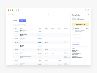
Orders (SaaS Web app)
The key to a truly great call to action is that it DOESN’T actually CALL FOR AN ACTION AT ALL.
So a truly irresistible call to action isn’t about reminding someone the action they need to take. It’s reminding them what they’re gonna get when they do that action.
One important thing to consider when you are creating an irresistible call to action is about visual contrast.
People tend to obsess about colors, like whether they should be orange or they should be blue, etc.
Color is not what really matters at all, but what does matter is that you MINIMIZE the clutter around the call to action so it’s THE NUMBER ONE THING THAT THEY SEE. You just need to make sure that it’s high contrast, so it stands out from the rest of the page.
🧠🎓👁 Curious about human behavior?
UX & Behavioral Psychology Lessons
Best,
Alex
