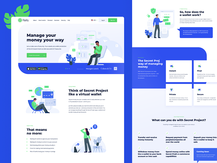
Payment system home page design
💼Full case check on our Behance - https://cutt.ly/4rnNos5
🌱When a new product enters the market that has its own niche, positioning and target audience, it is time to declare itself. And this is a very important step. Among the variety of similar products, it should catch clients' attention to make them remember it.
📱Therefore, we have made the design of the promo site for the American payment system in a style that is not typical for such a business sphere using stylish illustrations. To make users remember think - well, this is that very website with awesome graphics, even if they cannot recall the name of the product. You will not find the second payment system in the world with such a promo site.
👀Make sure to subscribe to our social media: Instagram | Behance | LinkedIn
📮Share your impressions in the comments section and leave us a big thumbs-up. And if you need a mobile app design for a payment system and a promo website for it, then reach out at hello@equal.design
