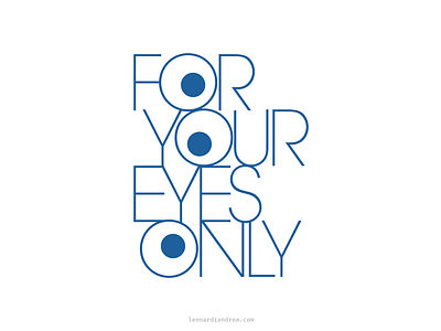
For Your Eyes Only Logo
I do it for your eyes only!
I designed this logo back in the university days for a semester exhibition about glasses and eyewear.
I love it because it's ambiguous, trying to balance a serious blue colored minimal font (it's Avantgarde) with an hilarious three eyed glance staring at the observer...
What about it?
More by Andrea Leonardi View profile
Like
