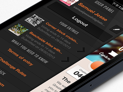
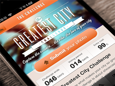
Fotomojo User Panel
This is the user panel for Fotomojo, the photo challenge app - this familiar style of settings panel for iOS allows users to manage their submissions, edit their details etc.
Attached is the full pixels of the design to check out. As always I would love feedback. I'm wondering if I should double the thickness of the horizontal line dividers. For a non retina design I would use 2, 1px lines (1 dark, 1 light) to give the depth. I like the finer detail that retina allows in keeping it only 1px, but wondering peoples practices here? Hope that makes sense.
More by Samuel Jesse View profile
Like


