Onboarding new Thrive Users
A few months ago the Product Team at Thrive set out to change how prospects can trial our platform. We started by analysing the customer journey then created user flows, brainstorming ways for prospects to move through the process completely digitally, with their own customised demo app to play with by the end of it.
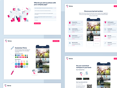
We streamlined the process to few key steps, as you can see in the designs.
(See wireframes and designs in the downloads 😃 →)
1. Create an account for their organisation in our system using their details. We spent some time determining the best way to validate the form to ensure this part was as frictionless as possible, settling on "After & While" validation for most cases, with the exception of the password field which uses persistent indicators so errors are instantly highlighted whilst changes are being made.
2. Capture their reason for wanting an employee communications app. These goals help us not only understand why our customers buy our app and use this info to guide them later, but also to reinforce what value Thrive could bring to their organisation.
3. Users can begin customising their app with their brand colours and a complementary app icon. We populate the app screen with imagery related to their organisation's industry. This step is key as it really helps the app feel like something they've built.
4. The next stage begins to educate the user on what type of content may be useful for them to include in their app, and they can select the relevant sections to add to their demo app.
5. Their app is then ready for them to view. This step guides them towards downloading the Thrive app and allowing them to very easily log in by scanning the QR code on the screen.
My role in this project was in leading the user experience and wireframing a solution that would move prospects along the sales funnel while guiding them in creating an app for their org. Fellow designer mate at Thrive, Lois, applied the visual layer and designed the beautiful illustrations!
