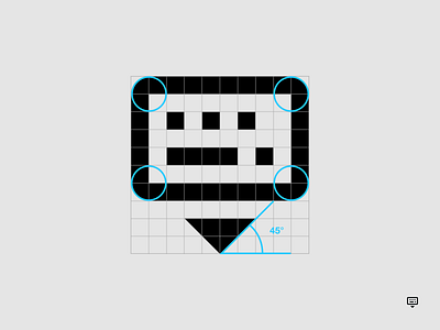
Automattic — UI Iconography (icon grid)
“Simplenote icon system re-design” with the ✨splendid✨ product and design team at Automattic (the people behind WordPress.com, Tumblr, and more).
ANGLES 📐🔍
I employ 45° angles, even for anti-aliasing, and when other angles are required for the optimal depiction of the shape I'm creating I employ 15° increments. By being consistent in the increments chosen for the angles, I'm able to establish a harmonious feel to a complete set of icons.
ABOUT SIMPLENOTE
Simplenote is a note-taking application with markdown support. In addition to cross-platform apps, it can be accessed via most web browsers.
_________
A project like this in the works? Just drop me a line: info@xicons.co
Find more:
Free icons / Case studies
More by Carlotta Govi View profile
Like
