EQL group - mark

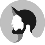
EQL group - Identity⠀ .⠀ Explaining this project would sum to one word: Terrific! The amount of trust I have been given is astounding. Perfect client.⠀ .⠀ After brief first meeting we have set a goal to create an identity that would represent business that operates in Human Resources, and has some attributes of my clients vibrant personality.⠀ .⠀ Now the question is: What makes a HR consultant worthy to hire? I believe it is his/her ability to arrange processes to work in harmony. To spot talent where others see clumsiness. This job might get too cold and impersonal. It is where I apply contrast to shift the tide.⠀ .⠀ Our goals for the new identity were to convey trustworthiness and openness. This mark is a collection of contrasting shapes put simple. The sun that you see symbolizes the Energy and Enthusiasm of my clients persona, yet the sharp parts reflect their internal compass which leads them in the right decision making.⠀ .⠀ Overall construction felt smooth and clean which was later confirmed as a winning logo sketch.⠀ .⠀ How do you feel about this one?