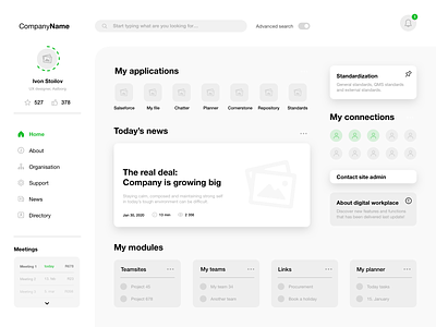
Intranet - wireframe design
It’s been over a year since I have dribbble account, so I think it’s time for my first shot :D
This is a project I have been working on past few months, so I decided to share the UX behind it.
The wireframe design shows the Home page of an intranet - digital employee experience, tool that many employees need to work with during their work time.
All the data you see here are based on the User Research (qualitative - interviews, observations, client meetings), Competitor Research (direct & indirect) and Analysis (using coding methods and analytic memos); collected by me and my 3 teammates.
How do you like it?
Special thanks to:
Stanko Bagin, who is my UX hero and had quite patience with me; thought me about UX a lot.
Lukas Horak, who always pushed me to do what I love and who is the best mentor I’ve ever had.
Anna Hajkova, who supports me and my work every single day.
And Scott Carter, for his time, care and feedback.
