The Roots


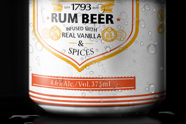


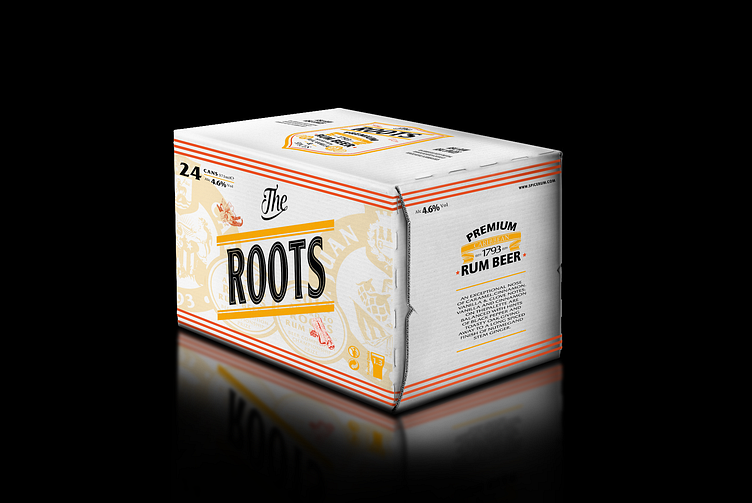

THE ROOTS
Packaging design proposal for a liquor company based in London, UK. PRF (Proof Drinks) intended to create a sub brand called Spice Rum. Co that would pride itself with selling one of highest quality rum beers on the market. It's use of real flavours and spices instead of sweetening's was the motive to solidify itself amongst the best.
Idea was to create a label design which tells a story, shows its roots and pride. Typography is set to be the focal point as well as the driving force, backed by graphics to help achieve its communication.
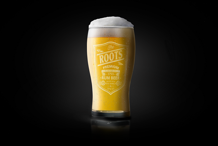
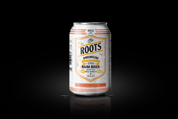
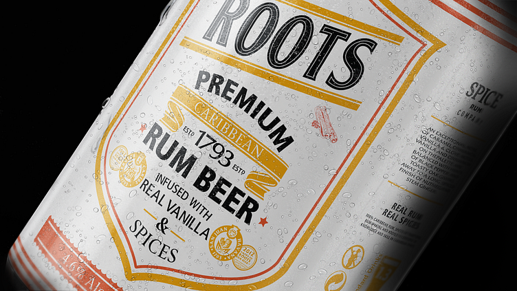
