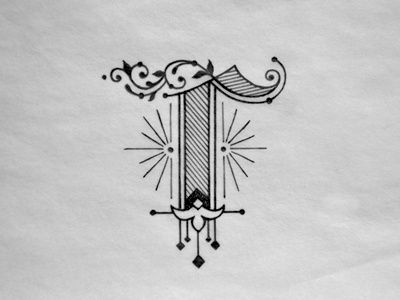
S
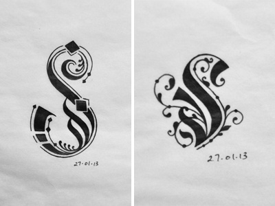
I made two sketches for S, initially I liked the one to the left more but after inking them, maybe not so much, that one reminds me of the 6 I did. I think I'll remove the top diamond. Both are inspired by gothic and arabic typefaces.
Which one do you like more?