Brendan Mcgrath Welding

First design job in a very long time, and I must admit, it's pretty difficult getting back in to the swing of it!
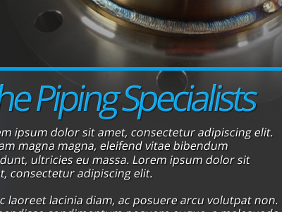
The website is for a Welding and Maintenance business. Their logo looks as though it was made in Word, so trying to use the blue from the logo as highlights in the design.
Biggest problem is now the white space. I'm not exactly sure how to continue the design on down the page.
Any feedback or suggestions would be wonderful! :)
