Enginova Company
A construction company named Enginova is in need of a logo for their business. The company chose the name Enginova, which combines the words "engine" and "nova." The word engine signifies a combination of movable and immovable objects that are used in the construction of buildings, among other things. Meanwhile, the word Nova refers to an event that occurs as a result of a star reigniting after being dormant for many years. The purpose of this is to demonstrate the company's energy and power.
After reading the brief, I propose the following logo concept:
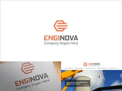
Hexagonal or six-sided in shape, as it is unique for several reasons:
a. Symmetry: A hexagonal shape has six sides that are of equal length and angles that are of equal measure. This provides strong symmetry to the shape, which is often considered a symbol of beauty and perfection.
b. Efficiency: A hexagonal shape is a highly efficient geometric shape in terms of space usage. In natural crystal structures such as honeycombs or snowflakes, this shape allows for a strong and stable structure with minimal materials.
c. Interconnectivity: Hexagonal shapes have the ability to connect closely with other polygonal shapes. By combining many hexagonal shapes, you can create patterns that resemble triangles, squares, or even more complex shapes like stars or flowers.
2. Add a symbol of three stacked iron bars to indicate that this is a construction company.
3. Letter E as the company's initials. The symbol of three stacked iron bars will form the letter E.
4. The colors I chose are orange: This color can refer to the strong spirit of completing projects, optimism in facing challenges, or excitement in seeing the final results of the projects being built. The second color is gray: This color can refer to the strength and calmness in facing complicated or dangerous situations during the construction process, or the simplicity in the company's approach to effectively and efficiently completing projects.
And here is the resulting logo!
