Pay With Toast - Before and After Iteration
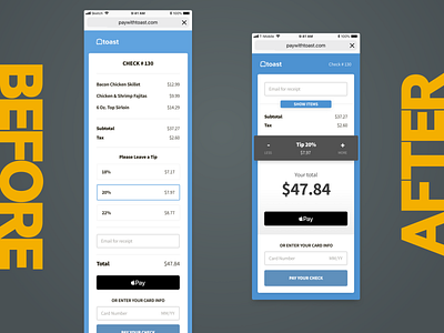
A facelift would not be complete with a before and after shot.
The biggest change in the new version was improving the information hierarchy of the page. Contrast was also improved. The page was made more concise.
Given an interface, there's always an implicit tension between "What is this telling me?" and "What does this want me to do?" for a user. The new version strikes a better balance between providing information and asking for action; there is more intentionality behind how and when information is displayed to a user.
These changes were informed by data from analytics tools, heatmaps, as well as in-person user interviews with diners after they used the product organically in restaurants.
